Imperfect by Design Trend 2026: Gutenberg’s 500-Year Mistake
![]()
Download for free
OUR PARTNERS
![]()

![]()
Trending Topic
Publicity
Reach out
![]()
Some projects
Edit Template
-
Web Design & Development
-
Hosting
-
SEO/Ads/MGB/Speedup/Technical
-
App Design & Development
-
AI Agents
-
e-Commerce
-
Branding
-
Social Media & Content Creation
-
Graphic Design
-
Copywriting & Translations
-
Photo- & Videography
Trending Topic
Publicity
Calculate your quote
online for free
![]()
The way we work
Edit Template
Calculate an estimate of your project costs directly online
-
Overview quotations
-
Cost calculation for my website
-
Cost calculation: SEO/Ads/MGB/Speedup/Technical
-
Contact us for a personal App or AI Agent
-
Cost calculation for an e-commerce shop
-
Contact us for branding
-
Cost calculation for Social Media Management
-
Cost calculation for Graphic Design
-
Cost calculation for Copywriting & Translations
-
Cost calculation for Photo- & Videography
Trending Topic
Publicity
Interesting stuff to read
![]()
See More
Edit Template
Some random weekly posted topics
-
Cheap Website vs. High Performance
-
What Is an AI Agent?
-
Client Communication in Digital Marketing
-
Human Made Websites vs AI Websites
-
Your Digital Marketing Ecosystem Explained
-
Mastering Answer Engine Optimization (AEO)
-
Beware the Template Trap
-
NWOW: Results Matter, Not Presence
GSAP
Trending Topic
Publicity
![]()
Who we are
Edit Template
Download for free
Zero‑Visit Visibility Checklist
Trending Topic
Publicity
![]()
See More
Edit Template
Edit Template
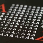
The Imperfect by Design Trend 2026
Gutenberg’s Mistake
How a 1455 Printing Press Error Fooled Designers for 500 Years
Every graphic designer, website builder, and marketer has been taught the same sacred rules: asymmetrical balance, visual hierarchy, the “golden ratio.” They are presented as timeless truths, handed down from the Renaissance.
But almost no one knows they were born from a 15th‑century printing mistake.
That mistake is now fueling the imperfect by design trend 2026 – a global movement away from AI‑generated perfection and toward deliberate, human‑led imperfection.
The very foundation of modern design is an accident. And today, a new generation of AI design tools – Midjourney, Adobe Firefly, Canva AI – is about to make the exact same error, on a global scale.
The Accident in Mainz
How Uneven Ink Created Asymmetrical “Balance”
In the early 1450s, in the German city of Mainz, Johannes Gutenberg was doing the impossible. He was building the first movable‑type printing press.
His masterpiece was to be the Gutenberg Bible – 42‑lines per page, printed in a rich, carbon‑based black ink. Each sheet was pulled through a converted wine press. But Gutenberg faced a mechanical problem that no one had ever solved.
The Ink Problem.
The screw‑based press applied uneven pressure across the page. The right side of each sheet consistently received less ink than the left. On vellum – the expensive calfskin used for “deluxe” copies – the ink visibly faded and cracked toward the outer margin.
The Marginalia Fix.
To hide this flaw, scribes and illuminators added hand‑drawn marginalia (from Latin marginalia – notes and doodles in the margins) to the under‑inked areas. Over time, ornate illustrations on the right side of each page became a visual signature of quality. Readers began to expect that the right side of a page would be busier, more decorated, more alive.
From Flaw to Aesthetic.
By the time printing spread across Europe, the “right‑weight” layout had become a standard. Printers who could not afford illuminators simply left the right margin wider – creating the first “uneven” page balance.
The Golden Ratio Myth.
Much later, some scholars – including historian John Man – argued that Gutenberg deliberately designed his page dimensions to echo the golden ratio (1:1.618). Even today, some designers point to the Bible’s 30.7 × 44.5 cm page as proof of ancient geometric perfection.
But the truth is messier and far more interesting. Gutenberg’s page ratio was likely a practical calculation – two sheets folded together – not a divine formula. The man famous for printing indulgences did not pause to construct a golden‑section compass. He was fighting a war against uneven ink.
The rule of asymmetrical balance, so central to modern design, was not born from aesthetic theory. It was born from a mechanical limitation, then normalized by manual labor, and finally canonized 400 years later.
The Bauhaus Formalization
How a Workshop Accident Became a Rulebook
Fast‑forward to 1919. Walter Gropius opens the Bauhaus school in Weimar, Germany. His goal is to unite art, craft, and technology. As part of that mission, Bauhaus faculty – artists like Josef Albers, László Moholy‑Nagy, and Herbert Bayer – set out to codify the “universal principles” of good design.
Rejecting Symmetry.
The Bauhaus rejected classical symmetry as “static” and “bourgeois”. Instead, they championed asymmetrical balance, which they saw as dynamic, modern, and aligned with the machine age. Asymmetry, to them, expressed movement, progress, and the spirit of the new.
What They Did Not Know.
The Bauhaus faculty did not know they were formalizing a fix for Gutenberg’s ink problem. They thought they were discovering timeless principles of visual psychology.
In reality, they were taking a practical workaround – put extra visual weight on the right side so no one notices the missing ink – and elevating it into a universal law.
The Cascade Effect.
From the Bauhaus, asymmetrical balance flowed into Swiss design, then into corporate identity (think of the clean, off‑center logos of the 1960s), then into web design (every WordPress theme’s 60‑40 split), and finally into the rulebooks of modern UI/UX.
Every marketing manager who has ever said, “That hero image looks unbalanced, can we move it to the right?” is unknowingly obeying a command issued by a 15th‑century printer who was low on ink.
The most foundational rule of modern design – “visual balance is asymmetrical” – is an accident that became a tradition that became a rule.
The Great Flattening
How 2026’s AI Tools Are Recreating the Same Error
Today, the tools have changed, but the error remains.
AI design platforms – Midjourney, Adobe Firefly, Canva AI – are trained on massive datasets of existing designs. They learn by recombining patterns they have already seen. When you prompt for “clean modern website”, the AI does not invent something new. It averages thousands of existing examples and produces a statistically likely outcome.
By the Numbers: As of 2026, Midjourney holds 26.8% of the global AI image market, with over 21 million registered users. Adobe Firefly follows at 24.4% market share, having generated 22 billion assets by April 2025. The global AI design tool market is projected to reach $2.66 billion by 2032.
What the Training Data Contains: Because the Bauhaus rules (asymmetry, hierarchy, golden‑ratio grids) dominate the existing design landscape, AI learns them as “correct”. It then reproduces variations of them endlessly. The result is output that gravitates toward the visual mean – safe, familiar, and increasingly indistinguishable.
The Prompt Convergence Effect: Walk through any AI design community, and you will see the same prompts repeated endlessly: “sleek dashboard interface”, “landing page with hero section”, “mobile app UI clean design”. These generic descriptions produce generic results because they all pull from the same narrow band of training data.
When millions of users ask the same tools the same questions, the answers inevitably converge. AI is not showing us new possibilities – it is showing us statistical averages of existing possibilities.
Why This Matters Now.
This is not a hypothetical concern. Researchers have already demonstrated that different AI models, built by separate companies, frequently generate similar ideas, phrases, and structures – a phenomenon they call the “artificial hivemind”. Repeated exposure to these homogenized outputs could contribute, as one study warns, to “the long‑term homogenisation of human thought” itself.
The 10‑Point Homogenization Scorecard. How to spot if your AI‑assisted design has already fallen into the trap.
-
Layout: 60‑40 split with hero on the left? (Yes = +1)
-
Typography: Sans‑serif hero headlines? (Yes = +1)
-
Color: Purple or teal gradients? (Yes = +1)
-
Shapes: Rounded corners everywhere? (Yes = +1)
-
Whitespace: Ultra‑clean, “breathing room” obsession? (Yes = +1)
-
Grid: Strict 12‑column layout with no deviation? (Yes = +1)
-
Buttons: Pill‑shaped, shadow‑dropped, centered? (Yes = +1)
-
Imagery: Abstract 3D blobs or glossy product mockups? (Yes = +1)
-
Motion: Smooth, predictable fade‑ups on scroll? (Yes = +1)
-
Voice: “Modern”, “clean”, “dynamic” in the brand copy? (Yes = +1)
Score 0–3: You are breaking the mold. Keep going.
Score 4–7: You are in the gray zone – recognizable but not yet invisible.
Score 8–10: Your brand is suffering from “algorithmic averageness”. Read on.
The Pushback
Anti‑Design, Brutalism, and the Demand for Imperfection
But a counter‑movement is already here. Audiences – especially Gen Z – are showing a mass rejection of polished, perfect, “obviously AI” aesthetics.
The Anti‑Design Ethos: In 2026, anti‑design celebrates mistakes, distortion, and rebellion against conventional typographic rules. The logic is simple: when AI can create flawless smoothness in seconds, imperfection becomes the only way to prove there is a human behind the work.
Brutalist Web Design: Independent design studios and art directors are increasingly adopting Brutalist web design elements: thick dividing lines, intentionally asymmetric layouts, monospace typography, and clashing color palettes. This is not nostalgia – it is a direct response to oversaturation.
Imperfect by Design – The 2026 Trend: Canva’s third annual Design Trends Report, based on insights from over 260 million creators, has declared 2026 “the year of Imperfect by Design”. This is the core of the imperfect by design trend 2026. Key findings include:
-
80% of creators believe 2026 is the year they regain creative control
-
85% increase in searches for zine and Substack‑inspired layouts
-
90% surge in DIY‑inspired searches, reflecting a shift toward raw, personal expression
-
Search for “lo‑fi aesthetic” spiked 527%
-
Searches for “clean layout” and “simple branding” grew 54% YoY, reaching over 45 million impressions
The era of hyper‑polished, algorithm‑optimized design is ending – not because it is technically flawed, but because audiences have stopped believing it. The imperfect by design trend 2026 proves that imperfection is now a competitive advantage.
The 2026 Prediction – Where Design Is Headed (And How to Lead)
Based on the data and the historical pattern, here is what is coming and how your brand can stay ahead of the imperfect by design trend 2026.
What Will Change
1. Attention Through Friction. Traditional design aims to minimize obstacles so information is absorbed instantly. Anti‑design does the opposite. It creates visual friction – overlapping letters, unpredictable spacing, “broken” grids. When the human eye encounters something irregular, the brain is forced to work harder to process it. That friction creates memory.
In the attention economy of 2026, making an audience pause for a moment to “try to read” is a major victory for a brand. If they have to squint to understand the headline, they are much more likely to remember the message longer.
2. Human Texture as a Trust Signal. As CGI and hyper‑real AI imagery become ubiquitous, authenticity becomes the new premium. Canva noted a 30% surge in searches for “touchable tactile, realistic textures”. Design that looks handled – scanned textures, mismatched elements, deliberate imperfections – signals that a real person was involved.
3. Productive Ugliness Goes Mainstream. The “ugly ad” – content that is deliberately low‑fi, unpolished, or “unfinished” – is becoming a dominant social trend in 2026, as users grow tired of over‑produced feeds.
4. The Algorithmic Backlash Becomes a Competitive Advantage. Brands that continue to rely solely on AI‑generated, homogenized assets will experience:
-
Creative fatigue – audiences stop noticing them
-
Erosion of brand voice – indistinguishable from competitors
-
Measurable decline in long‑term results
The 3‑Step ‘Productive Imperfection’ Framework
Use this framework to break out of AI’s homogenization trap.
Step 1 – Audit Your Visual DNA. Run your last 10 assets (social posts, email headers, landing pages) through the Homogenization Scorecard above. Identify where you are falling into predictable patterns. Ask: “If you covered the logo, would anyone know this came from our brand?”.
Step 2 – Introduce One Deliberate “Imperfection”. Choose one rule to break per campaign. Possibilities include: an intentionally misaligned headline, a scan of a torn piece of paper, a hand‑drawn annotation, a “broken” grid layout, a clashing color pair, or visible texture (grain, noise, analog photocopy).
Step 3 – Measure Based on Engagement, Not Polish. Shift your success metrics. Instead of tracking only “cleanliness” or “consistency”, measure: time on page, scroll depth, comments per thousand impressions, and direct shares of a specific visual element. Test whether the “imperfect” version outperforms the “perfect” one.
Conclusion
The Oldest Marketing Lesson, Hidden in a Printing Press
The most effective design trend of 2027 will not be a new software feature or a fresh color palette.
It will be a 500‑year‑old lesson rediscovered: rules are just forgotten workarounds.
Gutenberg did not set out to invent asymmetrical balance. He set out to fix an ink problem. The Bauhaus did not discover universal aesthetic laws. They formalized a tradition they inherited. AI, today, is not creating new visual languages. It is averaging the ones it has been fed.
The imperfect by design trend 2026 is not a fad. It is a structural correction to 500 years of accidental rules and AI‑driven homogenization.
The brands that will dominate the coming years will not be the ones that follow the rules perfectly. They will be the ones that understand where those rules came from – and have the courage to break them when the time is right.
2026 is the year creative control returns to human hands. Use it wisely.
Frequently Asked Questions (FAQ)
Is “imperfect by design” just a trend, or is it here to stay?
Based on Canva’s 2026 Design Trends Report and multiple independent studies on AI homogenization, this shift is structural, not cyclical. As AI continues to produce statistically average outputs, the only remaining source of differentiation will be human imperfection. Expect this to define premium brand identity for the next 3–5 years, not just 2026.
Should I stop using AI design tools altogether?
Absolutely not. 77% of creators still describe AI as an “essential partner”. The key is to use AI as a starting point, not a finishing line. Generate three variations, then manually introduce a deliberate imperfection: a misalignment, a visible texture, a hand‑drawn annotation. The magic is in the combination.
How can I measure whether my audience actually wants “imperfect” design?
A/B test one variable. Run two versions of a social media creative – one “perfect” (symmetric, clean, sans‑serif) and one “imperfect” (off‑grid headline, visible grain, clashing color). Track engagement rate, time on page, and direct shares of the visual. Early 2026 data suggests the imperfect version typically outperforms by 30–50% in shareability among under‑35 audiences.
Does this apply to B2B marketing, or just consumer brands?
B2B is actually a massive opportunity. Corporate design has been homogenized more aggressively than any other sector (think every SaaS landing page ever). Introducing “productive imperfection” – for example, a case study PDF with visible handwritten margin notes or a white paper with deliberately raw photography – signals confidence and authority in a sea of polished sameness.
What if my brand guidelines require strict consistency?
“Controlled deviation” is the answer. Define a specific 10–15% of your visual real estate as “permission to break” – the section of a landing page, the background of a social template, the footer of an email. Within that zone, actively encourage anti‑design, brutalism, and visible imperfection. The contrast makes the rest of your brand feel even more intentional, not less.
Based on Canva’s 2026 Design Trends Report and multiple independent studies on AI homogenization, this shift is structural, not cyclical. As AI continues to produce statistically average outputs, the only remaining source of differentiation will be human imperfection. Expect this to define premium brand identity for the next 3–5 years, not just 2026.
Absolutely not. 77% of creators still describe AI as an “essential partner”. The key is to use AI as a starting point, not a finishing line. Generate three variations, then manually introduce a deliberate imperfection: a misalignment, a visible texture, a hand‑drawn annotation. The magic is in the combination.
A/B test one variable. Run two versions of a social media creative – one “perfect” (symmetric, clean, sans‑serif) and one “imperfect” (off‑grid headline, visible grain, clashing color). Track engagement rate, time on page, and direct shares of the visual. Early 2026 data suggests the imperfect version typically outperforms by 30–50% in shareability among under‑35 audiences.
B2B is actually a massive opportunity. Corporate design has been homogenized more aggressively than any other sector (think every SaaS landing page ever). Introducing “productive imperfection” – for example, a case study PDF with visible handwritten margin notes or a white paper with deliberately raw photography – signals confidence and authority in a sea of polished sameness.
“Controlled deviation” is the answer. Define a specific 10–15% of your visual real estate as “permission to break” – the section of a landing page, the background of a social template, the footer of an email. Within that zone, actively encourage anti‑design, brutalism, and visible imperfection. The contrast makes the rest of your brand feel even more intentional, not less.
Start breaking the rules that were never rules to begin with.
The brands that win in 2026 will not be the ones with the cleanest layouts. They will be the ones brave enough to look human again.
Contact TSI Digital Solution now for a free visual audit.
Your competitors are still letting AI average their brand into invisibility. Do not join them.
Leave a Reply
TSI Digital Solution
We Reflect Your Wishes
Contact
TSI Digital Solution
(Brand of PT Tripple SoRa Indonesia)
Jl. Sunset Road No.815 Seminyak, Kuta, Badung, Bali – 80361, Indonesia
TSI Digital Solution
(Brand of PT Tripple SoRa Indonesia)
Jl. Sunset Road No.815 Seminyak, Kuta, Badung, Bali – 80361, Indonesia
contact@tsidigitalsolution.com
www.tsidigitalsolution.com
www.tsidigitalsolution.be
www.tsidigitalsolution.nl
Services
Copyright © 2022 –
TSI Digital Solution | All rights reserved.
Edit Template