When Helvetica Almost Started a War
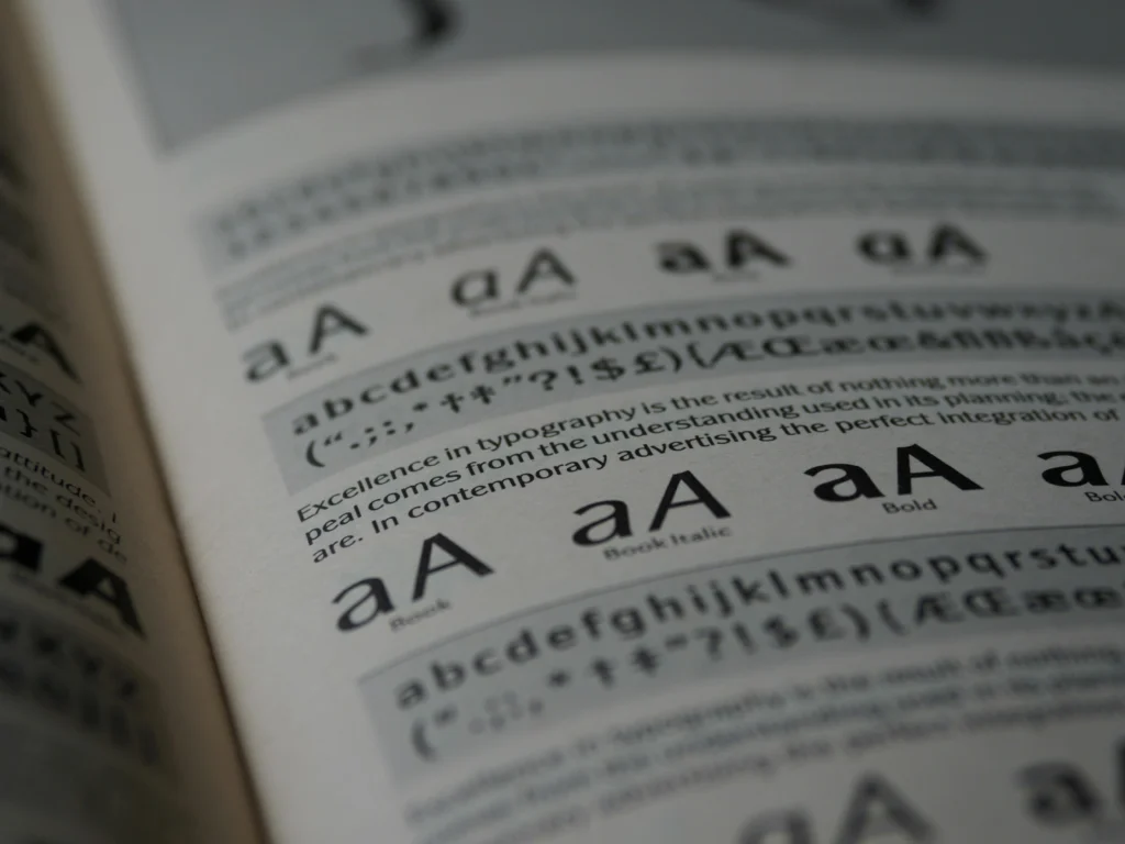
About us Services Projects Blogs Contact us Languages NL BE Hamburger Toggle Menu About us Courses University TSI Login Team TSI Digital Solution OUR PARTNERS Trending Topic Publicity Reach out Some projects Edit Template Services Web Design & Development Hosting SEO/Ads/MGB/Speedup/Technical App Design & Development AI Agents e-Commerce Branding Social Media & Content Creation Graphic Design Copywriting & Translations Photo- & Videography Trending Topic Publicity Calculate a quote online yourself The way we work Edit Template Realized projects Calculate an estimate of your project costs directly online Overview quotations Cost calculation for my website Cost calculation: SEO/Ads/MGB/Speedup/Technical Contact us for a personal App or AI Agent Cost calculation for an e-commerce shop Contact us for branding Cost calculation for Social Media Management Cost calculation for Graphic Design Cost calculation for Copywriting & Translations Cost calculation for Photo- & Videography Trending Topic Publicity Interesting stuff to read See More Edit Template Blogs Some random weekly posted topics Cheap Website vs. High Performance What Is an AI Agent? Client Communication in Digital Marketing Human Made Websites vs AI Websites Your Digital Marketing Ecosystem Explained Mastering Answer Engine Optimization (AEO) Beware the Template Trap NWOW: Results Matter, Not Presence GSAP Demo site GSAP animation Trending Topic Publicity Who we are Edit Template Contact us Affiliate program Download for free TSI Spam Blocker Trending Topic Publicity See More Edit Template Edit Template Font Psychology Get An Online Quote When Helvetica Almost Started a War The Hidden History of Why Your Font Choice Matters More Than You Think You’re standing in an airport terminal. Above you, a sign reads “GATES 12-24” in crisp, confident letters. You don’t notice the font. You just feel calm, this airport knows what it’s doing. Twenty minutes later, you pass a small coffee shop with hand-painted lettering on the window. You don’t notice that font either. You just feel drawn in, this place feels human. You’ve been manipulated three times before breakfast, and you never noticed. This is typography psychology in action, the study of how letterforms shape perception before conscious thought begins. Every font is a spy. Every curve, every serif, every stroke carries hidden messages about power, class, trust, and identity. And if you’re running a business, building a brand, or simply trying to communicate and you don’t understand font meaning, you’re letting strangers speak for you. This isn’t marketing theory. This is history. This is psychology. This is the story of how letters started wars, toppled regimes, and elected presidents. And it starts with the font Hitler banned. The Secret History of Type: When Letters Became Weapons The Font Hitler Tried to Kill In 1941, the Nazi regime made an announcement that shocked Germany. They banned Blackletter. For centuries, Blackletter: that dense, gothic script you associate with newspapers and beer steins, had been the definitive German typeface. It was the font of Luther’s Bible. The font of German identity. The font the Nazis themselves had used on posters and propaganda for years. Then Hitler discovered its origins. Blackletter wasn’t pure Aryan design. It was based on Jewish script. Within weeks, the regime declared their own national font “corrupt”, “un-German”, and forbidden. They replaced it with Antiqua, the more Roman, “well-mannered, enlightened, respectful” letterforms we recognize today. Think about that. A font was banned because of its ancestry. Letters became racial identity. Typography became genocide. This is the political history of fonts, a story most designers never learn, but one that shapes every typeface we touch. This isn’t ancient history you can ignore. When you choose a font today, you’re reaching into a toolbox that contains weapons. Every typeface carries the ghost of its past. The question is whether you know what you’re picking up. Another Font That Killed the King Now travel back to revolutionary France, 1789. The aristocracy is falling. Heads are rolling. And a new typeface emerges that captures the moment perfectly. Didot is sharp. Severe. Geometric. It has none of the flowing, handwritten curves that decorated aristocratic documents. It doesn’t bow. It doesn’t apologize. It declares. To use Didot in 1790 was to announce: “I am modern. I am rational. I have killed the king.” This is the moment type becomes political in a new way. Fonts stop being just tools for reading. They become flags. Vogue still uses Didot today for its covers, not because it’s pretty, but because it screams fashion’s version of revolution: “We are the arbiters. We decide what matters. Everyone else follows.” One That Tried to Be Nothing Fast forward to Switzerland, 1957. The world is recovering from another war. People are tired of ideology, tired of flags, tired of fighting about identity. Enter Helvetica. Its creators didn’t set out to make a beautiful font. They set out to make nothing. No personality. No emotion. No politics. Just pure information. Clean. Neutral. Universal. It was the most ambitious lie of the twentieth century. Helvetica became the font of corporations because it looked like they had nothing to hide. It became the font of government because it looked like bureaucracy was rational. It became the font of airports because it looked like your luggage might actually arrive. But neutrality is a performance. When you choose Helvetica, you’re not being neutral but you’re signaling that you belong to the global, corporate, “rational” world. You’re siding with systems over people. With efficiency over emotion. With Switzerland over everywhere else. And The Font That Won the White House Now jump to 2008. America is exhausted. War, recession, cynicism. Then a candidate appears who talks about hope. His campaign needs a font. They don’t choose something revolutionary. They don’t choose something neutral. They choose Gotham, a typeface based on lettering from New York City bus stops. Gotham is sturdy. Honest. It doesn’t look like it came from a design studio. It looks like it came from the streets. It feels like the guy next door, not the guy on television. Barack Obama didn’t win because of a font. But the font carried him. It said
What Is Graphic Design? Mastering the 4 CRAP Principles

About us Services Projects Blogs Contact us Languages NL BE Hamburger Toggle Menu About us Courses University TSI Login Team TSI Digital Solution Reach out What we have realized See More Edit Template Services Web Design & Development Hosting SEO/Ads/MGB/Speedup/Technical App Design & Development AI Agents e-Commerce Branding Social Media & Content Creation Graphic Design Copywriting & Translations Photo- & Videography Calculate the price online yourself The way we work See More Edit Template Realized projects Calculate an estimate of your project costs directly online Cost calculation for my website Cost calculation: SEO/Ads/MGB/Speedup/Technical Contact us for a personal App Contact us for your AI Agent Cost calculation for an e-commerce shop Contact us for branding Cost calculation for Social Media & Content Creation Cost calculation for Graphic Design Cost calculation for Copywriting & Translations Cost calculation for Photo- & Videography Get a detailled quote Interesting stuff to read See More Edit Template Blogs Demo Just ask, we are here for you Who we are See More Edit Template Contact us Affiliate program Download for free TSI Spam Blocker Get a detailed quote Interesting stuff to read See More Edit Template Edit Template Graphic Design Principles Get An Online Quote What Is Graphic Design? Mastering the 4 CRAP Principles First impressions are everything. Every scroll, click, or tap brings your audience face-to-face with your brand, often for just a few seconds. This is where graphic design becomes more than decoration, it becomes a strategic tool. From eye-catching social media posts to conversion-focused websites, good design communicates your brand’s story, builds trust, and guides users toward meaningful action. But effective design doesn’t happen by chance. Behind every visually appealing and functional piece of content are four essential principles: Contrast, Repetition, Alignment, and Proximity, known in the design world as the CRAP principles. Understanding and applying these fundamentals can transform your visuals from simple aesthetics into powerful marketing assets that capture attention, drive engagement, and increase conversions. What Is Graphic Design? Graphic design is no longer just about making things “look pretty.” In digital marketing, it’s the language that communicates a brand’s identity, values, and messaging in a way that engages users instantly. Every visual element, from a website banner to a social media post, plays a role in shaping how potential customers perceive your brand. A well-crafted design can: Increase engagement: Social media posts with visuals get up to 650% more engagement than text-only content. Enhance brand recognition: Consistent design elements improve brand recall by 80%. Boost conversion: Professional visuals guide users toward actions, improving conversion rates by up to 35%. Design is a strategic tool that drives business outcomes, not just decoration. Understanding the underlying principles ensures that your graphics don’t just exist but they communicate, persuade, and convert. The 4 CRAP Principles: Effective Design The 4 CRAP principles: Contrast, Repetition, Alignment, and Proximity are foundational for designing graphics that not only look good but also perform well in digital marketing campaigns. Contrast – Make Important Elements Pop Contrast refers to the visual differences between elements to guide the viewer’s attention. It could involve color, size, typography, or shape. Why it matters in digital marketing: Highlights key messages: Buttons, headlines, and promotions stand out. Captures attention: In a scrolling feed, strong contrast makes content memorable. Example: A bright orange “Buy Now” button on a white background can increase click-through rates dramatically. Studies show color contrast in call-to-action buttons can boost conversions by 21%. Repetition – Build Consistency and Brand Identity Repetition is about using the same visual elements across your marketing materials: fonts, colors, shapes, or patterns. Benefits for digital marketing: Strengthens brand recognition: Familiar visuals make your brand instantly recognizable. Creates unity: A cohesive design improves overall user experience. Consistency in design leads to a brand recall rate of up to 80%, showing how repetition influences consumer perception. Alignment – Organize for Readability Alignment ensures that visual elements are arranged to create order and a clear flow. Misaligned content can appear chaotic, even if the colors and fonts are perfect. Digital marketing impact: Improves readability: Users process information faster when it is structured. Reduces bounce rates: Organized pages keep visitors engaged. For instance, left-aligned text with a consistent grid layout on websites can reduce user confusion and increase interaction with key content sections. Proximity – Group Related Items Proximity is the principle of placing related items close to each other. It helps users understand relationships between elements at a glance. Marketing relevance: Enhances comprehension: Grouped elements make content easier to scan. Improves user experience: Logical structure reduces cognitive load and frustration. For example, keeping product images, descriptions, and “Add to Cart” buttons together improves online shopping conversion rates significantly. Applying CRAP Principles Across Digital Marketing Channels Graphic design is at the heart of every digital touchpoint your audience encounters. Whether it’s your website, social media posts, email campaigns, or paid ads, each platform uses visual communication to attract, inform, and persuade. Applying the four CRAP principles: Contrast, Repetition, Alignment, and Proximity, ensures your brand visuals are not just appealing but also strategically effective. Let’s explore how each principle strengthens your marketing channels: Websites: Turning Design into User Experience Your website is your digital storefront, and design determines how long visitors stay and what actions they take. Contrast draws the eye to important sections, such as call-to-action buttons or key service highlights. A bold headline against a neutral background, for example, helps visitors immediately grasp your message. Alignment creates a logical path for the eyes to follow, making navigation smoother and encouraging users to scroll or explore. Proximity groups related content – like testimonials near contact forms or pricing near product details – making the layout intuitive and user-friendly. A clear, consistent structure doesn’t just look professional, it reduces bounce rates and increases conversions by keeping users engaged and confident in where to click next. Social Media: Designing for Attention and Consistency In crowded social feeds, your design needs to stop the scroll. Contrast helps posts stand out against competing
Mastering Color Palette Rules
About us Services Projects Blogs Contact us Languages NL BE Hamburger Toggle Menu About us Courses University TSI Login Team TSI Digital Solution Reach out What we have realized See More Edit Template Services Web Design & Development Hosting SEO/Ads/MGB/Speedup/Technical App Design & Development AI Agents e-Commerce Branding Social Media & Content Creation Graphic Design Copywriting & Translations Photo- & Videography Calculate the price online yourself The way we work See More Edit Template Realized projects Calculate an estimate of your project costs directly online Cost calculation for my website Cost calculation: SEO/Ads/MGB/Speedup/Technical Contact us for a personal App Contact us for your AI Agent Cost calculation for an e-commerce shop Contact us for branding Cost calculation for Social Media & Content Creation Cost calculation for Graphic Design Cost calculation for Copywriting & Translations Cost calculation for Photo- & Videography Get a detailled quote Interesting stuff to read See More Edit Template Blogs Demo Just ask, we are here for you Who we are See More Edit Template Contact us Affiliate program Download for free TSI Spam Blocker Get a detailed quote Interesting stuff to read See More Edit Template Edit Template Mastering Color Palette Rules Get An Online Quote Color Palette Rules The Complete Guide for Digital Marketing Success Color is a strategic asset that can define your brand, boost engagement, and drive conversions. At TSI Digital Solution, we know that understanding and applying the right color palette rules is key to standing out in a crowded marketplace. In this comprehensive guide, we explore every major rule in color theory, with a special focus on ratio-based guidelines like the classic 60-30-10 and its alternative variations, as well as complementary, analogous, triadic, split-complementary, tetradic, monochromatic, and warm vs. cool strategies. Read on to discover how these rules can transform your digital marketing strategy. The Cornerstone of Color: Ratio-Based Guidelines When it comes to creating a balanced design, ratio-based guidelines are the backbone of every successful color strategy. Let’s explore these in detail. The 60-30-10 Rule: The Time-Tested Classic The 60-30-10 rule is a foundational approach that divides your palette into three distinct parts: 60% Dominant Color: This forms the primary background and sets the overall mood. It’s the color that your audience sees first and that defines your brand’s identity. 30% Secondary Color: This color supports the dominant hue, used in areas such as sidebars, major sections, or text blocks. It ensures that the design remains cohesive without overwhelming the user. 10% Accent Color: Used sparingly, this color draws attention to key elements like call-to-action buttons, icons, or important headlines. It’s the spark that ignites user interest and engagement. When applied effectively in web design or social media graphics, the 60-30-10 rule guides the viewer’s eye through the content, creating a balanced experience that enhances usability and conversion rates. Alternative Ratio-Based Guidelines: Beyond 60-30-10 While 60-30-10 is immensely popular, designers often experiment with alternative ratios to better align with specific brand identities and design goals. Here are some variations: 70-20-10:In this approach, 70% of the design is dedicated to the dominant color. This is ideal for brands that want to establish a strong primary identity. The 20% secondary color supports the main hue, while 10% accent color provides that necessary pop for CTAs or highlights. Luxury brands and high-tech companies often favor this ratio to create an immersive, commanding presence. 80-20:Sometimes simplicity is key. An 80-20 split minimizes complexity by using 80% of one dominant color with 20% for a contrasting element. This minimalist approach works wonders in modern, corporate environments where clarity and focus are paramount. 50-30-20:Offering a more balanced distribution, this ratio gives more room to the secondary color, allowing for a richer supporting palette. Creative agencies and lifestyle brands can benefit from this approach, as it provides a nuanced yet dynamic visual experience. 90-10 Split:For ultra-minimalist designs, a 90-10 split leverages nearly a monochromatic base with a small accent. This is particularly effective for professional, clean web designs where the objective is to highlight content without overwhelming distractions. These alternative ratio-based guidelines offer flexibility. They allow you to experiment and tailor your design to your brand’s unique voice while still achieving visual harmony and a clear hierarchy of information. Diving Deeper: Other Essential Color Palette Rules Beyond ratio-based guidelines, there is a spectrum of color rules that digital marketers and designers should master. Each rule brings its own strength to the table, ensuring that every design choice reinforces your brand’s message. Complementary Colors Complementary colors are those that sit directly opposite each other on the color wheel. Think blue paired with orange or red with green. This high-contrast pairing creates a vibrant, energetic look that naturally grabs attention. In branding and social media, complementary schemes can be used to create logos and advertisements that stand out in a crowded digital space. They are particularly effective for call-to-action elements, ensuring that key messages and buttons are impossible to miss. Analogous Colors Analogous color schemes involve using colors that are adjacent on the color wheel, such as blue, blue-green, and green. This method produces a harmonious and unified look, ideal for creating a calm and cohesive user experience. When applied to user interfaces or background designs, analogous colors create an environment that feels consistent and inviting. They are especially popular among tech companies and wellness brands that strive for a tranquil aesthetic. Triadic Colors Triadic color schemes use three colors evenly spaced around the color wheel. An example would be the combination of red, yellow, and blue. This approach injects a balanced vibrancy into your design without overwhelming the viewer. Triadic schemes are excellent for dynamic websites and advertising campaigns, where a touch of energy is needed to captivate your audience while maintaining a professional appearance. Split-Complementary Colors A variation of the complementary rule, the split-complementary approach uses one base color alongside the two colors adjacent to its complementary color. This provides a softer contrast while still maintaining a high degree of visual interest. It’s a fantastic option
How Can Graphic Design Contribute to SEO

About us Services Projects Blogs Contact us Languages NL BE Hamburger Toggle Menu About us Courses University TSI Login Team TSI Digital Solution Reach out What we have realized See More Edit Template Services Web Design & Development Hosting SEO/Ads/MGB/Speedup/Technical App Design & Development AI Agents e-Commerce Branding Social Media & Content Creation Graphic Design Copywriting & Translations Photo- & Videography Calculate the price online yourself The way we work See More Edit Template Realized projects Calculate an estimate of your project costs directly online Cost calculation for my website Cost calculation: SEO/Ads/MGB/Speedup/Technical Contact us for a personal App Contact us for your AI Agent Cost calculation for an e-commerce shop Contact us for branding Cost calculation for Social Media & Content Creation Cost calculation for Graphic Design Cost calculation for Copywriting & Translations Cost calculation for Photo- & Videography Get a detailled quote Interesting stuff to read See More Edit Template Blogs Demo Just ask, we are here for you Who we are See More Edit Template Contact us Affiliate program Download for free TSI Spam Blocker Get a detailed quote Interesting stuff to read See More Edit Template Edit Template How Can Graphic Design Contribute to SEO Get An Online Quote Graphic Design & SEO. A New Approach to Digital Marketing Success When most people think about SEO (Search Engine Optimization), their minds go straight to keywords, meta tags, and backlinks. However, the role of graphic design in SEO is often overlooked, even though it is an essential part of any successful digital marketing strategy. SEO is no longer limited to textual content. Search engines like Google now consider user experience (UX), site speed, mobile compatibility, and overall design quality when ranking websites. Graphic Design At TSI Digital Solution, we believe that exceptional graphic design is not just about making a website aesthetically pleasing. It is more about creating a seamless user experience that works hand-in-hand with SEO to drive engagement and conversions. In this blog, we’ll explore how graphic design impacts SEO, what digital marketing clients need to know, and the advantages of focusing on design to boost your SEO performance. The Connection Between Graphic Design and SEO Before diving into how graphic design can contribute to SEO, it’s essential to understand the relationship between the two. SEO is primarily about making your website more visible in search engines by using various optimization strategies, including keywords, meta tags, and content. However, user experience (UX) is becoming increasingly important for SEO, and this is where graphic design comes in. In short, great design creates a seamless, engaging experience that keeps users on your site for longer, and search engines reward this behavior with higher rankings. User Experience and Engagement One of the primary ways graphic design impacts SEO is by enhancing UX. Search engines like Google prioritize websites that provide an intuitive, engaging, and accessible experience. When your website is aesthetically pleasing and easy to navigate users are more likely to stay on the page longer. It will reduce bounce rates and increase session durations – two key SEO metrics. A well-designed layout ensures users can find what they’re looking for quickly. Responsive designs for mobile devices ensure users can access your content on any screen size, which directly affects rankings since Google prioritizes mobile-friendly sites. Ranking Google ranks sites higher when users engage more, stay longer, and have a better experience. Beautiful, intuitive design leads to higher engagement metrics, which can improve your ranking in search results. Sites that offer a visually cohesive and pleasing experience see lower bounce rates. Meaning users are more likely to stay on your page, navigate through different areas of your site, and ultimately, convert. Example: Imagine two websites selling the same product. One has a clean, professional layout with well-placed visuals, while the other is cluttered, unprofessional, and hard to navigate. The first will naturally keep visitors engaged for longer, which Google sees as a positive ranking factor. Simply put, the longer users stay, the better the site’s chances of ranking well. Faster Loading Times Page speed is another critical factor in SEO rankings. Search engines like Google penalize websites that take too long to load. A clean and well-optimized graphic design can improve loading times by reducing the size of images, avoiding unnecessary design elements, and optimizing visuals for the web. Compressing images without sacrificing quality is essential for quick load times. Use of scalable vector graphics (SVGs) where possible, as they take up less space than raster graphics and load faster. Combining effective design with optimized coding ensures that your website remains visually appealing without slowing down, which is crucial for retaining visitors and pleasing search engine algorithms. Mobile Optimization More than half of global web traffic comes from mobile devices, and Google knows it. In fact, the search giant now practices mobile-first indexing, meaning it predominantly uses the mobile version of the site for ranking purposes. Graphic design plays a critical role in making sure your site is not only responsive but also fast-loading and functional across all screen sizes. Possibility: By implementing mobile-responsive design and ensuring that graphics are optimized for smaller devices, you can avoid slow load times and poor user experiences, both of which would harm your rankings. Visual Content Optimization Many people overlook the power of optimized images in SEO. Graphic design provides plenty of opportunities for incorporating keyword-rich file names, titles, and alt texts. Alt text is essential because it tells search engines what the image represents, and in case the image doesn’t load, this text appears instead. Including relevant keywords in image alt tags can help improve your SEO by boosting relevance. Use descriptive, keyword-rich filenames for each image (e.g., “digital-marketing-graphic-design.png”). Ensure that all alt tags describe the image while incorporating target keywords naturally. Avoid overloading alt texts with irrelevant keywords, as this could be penalized. Search engines Search engines are getting smarter at reading images through alt text and file names, but they still rely heavily on contextual clues to
Different Types of Logos
About us Services Projects Blogs Contact us Languages NL BE Hamburger Toggle Menu About us Courses University TSI Login Team TSI Digital Solution Reach out What we have realized See More Edit Template Services Web Design & Development Hosting SEO/Ads/MGB/Speedup/Technical App Design & Development AI Agents e-Commerce Branding Social Media & Content Creation Graphic Design Copywriting & Translations Photo- & Videography Calculate the price online yourself The way we work See More Edit Template Realized projects Calculate an estimate of your project costs directly online Cost calculation for my website Cost calculation: SEO/Ads/MGB/Speedup/Technical Contact us for a personal App Contact us for your AI Agent Cost calculation for an e-commerce shop Contact us for branding Cost calculation for Social Media & Content Creation Cost calculation for Graphic Design Cost calculation for Copywriting & Translations Cost calculation for Photo- & Videography Get a detailled quote Interesting stuff to read See More Edit Template Blogs Demo Just ask, we are here for you Who we are See More Edit Template Contact us Affiliate program Download for free TSI Spam Blocker Get a detailed quote Interesting stuff to read See More Edit Template Edit Template The Power of Logos in Digital Marketing Get An Online Quote Types of Logos. Primary, Secondary, Brandmark, and Alternative Logos Explained Your logo is more than just a simple graphic, it’s the visual representation of your brand’s identity. As the cornerstone of your branding strategy, your logo is key to creating an impression on your audience. But did you know there are multiple types of logos that you can use for different purposes? At TSI Digital Solution, we understand that creating a logo goes beyond aesthetics, it’s about creating a versatile and adaptable brand symbol that can be used in various digital marketing channels. This blog will delve into the four key types of logos: Primary Logos, Secondary Logos, Brandmark Logos, and Alternative Logos. Each plays a crucial role in building a cohesive and versatile visual identity for your business. Understanding Different Types of Logos To make the most out of your logo strategy, understanding the different types of logos: Primary, Secondary, Brandmark, and Alternative, can enhance your branding efforts. Each of these has its own place in digital marketing and brings unique advantages. Let’s break it down: Primary Logo: The Foundation of Brand Identity The primary logo is the most complete version of your logo and the one you’ll use most frequently. Typically, it includes the brand’s name, tagline, and any other essential design elements like icons or symbols. It’s the main logo that appears on your website header, business cards, email signatures, and other prominent places. Advantages of the Primary Logo: The Primary Logo is the cornerstone of your branding. It’s the full representation of your brand and typically includes your business name, tagline, and any design elements (such as a symbol or graphic). This is the logo you’d use on your website, main advertisements, and anywhere that calls for the full visual representation of your company. Advantages: Consistency: It creates a unified look across major touchpoints like websites, business cards, and brochures. Recognition: Since it’s used the most, it’s what customers will primarily recognize and remember. Versatility: A well-designed primary logo can be easily adapted to different formats without losing its impact. Tip: Make sure your primary logo is scalable. Whether it’s a small icon on a mobile site or blown up on a billboard, it should always be clear and recognizable. Secondary Logo: Adapting to New Contexts The secondary logo is an adaptation of the primary logo. While it retains the core elements of the primary logo, it is a simplified version designed for flexibility. For example, it may have the same font or icon but arranged in a different layout, perhaps more compact or horizontal. Advantages of the Secondary Logo: While the primary logo is used for the main branding, the secondary logo is often used in cases where the full logo might not fit or be necessary. Advantages: Adaptability: It gives you more options for using your logo across different platforms. Whether it’s social media banners, advertisements, or packaging, your secondary logo fits where the primary might not. Cohesion: Even though it’s a variation, the secondary logo stays true to your brand identity, keeping your marketing efforts cohesive. Less Clutter: Sometimes, less is more. A secondary logo can be less busy than the primary, focusing on just the brand name or one graphic element. Tip: Make sure the secondary logo complements your primary logo. It shouldn’t stray too far from the original, ensuring it’s still recognizable as part of your brand. Brandmark: The Icon That Speaks Volumes A brandmark logo is a symbol or icon that represents the company without any accompanying text. Think of Apple’s bitten apple or Nike’s swoosh. The brandmark is powerful because it communicates the essence of your brand in a minimalist, visual way. Once a brand achieves recognition, the brandmark can stand alone and still evoke the full identity of the brand. Advantages of the Brandmark: A Brandmark is the logo without any text. This is the pure visual symbol that represents your brand. Think of iconic brandmarks like Apple’s apple or Nike’s swoosh—no words needed, the image alone evokes the brand immediately. Advantages: Instant Recognition: A well-designed brandmark can be recognized at a glance, making it perfect for minimalistic designs like social media icons, website favicons, and app logos. Universal Appeal: Since it’s just an image, it transcends language barriers, making it great for international audiences. Simplicity: It’s simple, clean, and effective when space is limited. Tip: When designing a brandmark, make sure it’s simple yet unique. Avoid cluttering it with too many details—think in terms of shapes and symbols that will stand the test of time. Alternative Logo: A Playful, Creative Twist Alternative logos are creative variations of the primary logo, usually designed for more playful or casual use. These logos might use different color schemes, patterns, or fun illustrations. They
Benefits of Having an Animated 3D Logo
About us Services Projects Blogs Contact us Languages NL BE Hamburger Toggle Menu About us Courses University TSI Login Team TSI Digital Solution Reach out What we have realized See More Edit Template Services Web Design & Development Hosting SEO/Ads/MGB/Speedup/Technical App Design & Development AI Agents e-Commerce Branding Social Media & Content Creation Graphic Design Copywriting & Translations Photo- & Videography Calculate the price online yourself The way we work See More Edit Template Realized projects Calculate an estimate of your project costs directly online Cost calculation for my website Cost calculation: SEO/Ads/MGB/Speedup/Technical Contact us for a personal App Contact us for your AI Agent Cost calculation for an e-commerce shop Contact us for branding Cost calculation for Social Media & Content Creation Cost calculation for Graphic Design Cost calculation for Copywriting & Translations Cost calculation for Photo- & Videography Get a detailled quote Interesting stuff to read See More Edit Template Blogs Demo Just ask, we are here for you Who we are See More Edit Template Contact us Affiliate program Download for free TSI Spam Blocker Get a detailed quote Interesting stuff to read See More Edit Template Edit Template Benefits of Having an Animated 3D Logo Get An Online Quote Animated 3D Logo One that perfectly represents your brand and sets you apart from the competition Businesses are continually searching for new and creative ways to engage with their target audience. Even to stand out in a crowded online market. One of the best ways to do this is by incorporating an animated 3D logo into your website or as profile into social media. A 3D logo animation can make your brand come to life. It instantly attracts attention of your visitors and setting you apart from the competition. In this blog, we will discuss the benefits of 3D logo animation and why you should consider incorporating it into your website design or to use it in social media. What is an Animated 3D Logo? An animated 3D logo is a short, animated clip that showcases your brand’s logo in a dynamic and engaging way. This type of animation is created using 3D graphics software. Software that allows the logo to be animated in three dimensions, giving it depth and movement. 3D logo animations are often used in company introductions, product launches, and other marketing materials. This to create a memorable and impactful first impression. Benefits of an Animated 3D Logo for Your Website 1. Attracts Attention It can instantly capture the attention of your website visitors. With its dynamic movement, it creates a visual interest that can engage and entice your audience, making them want to learn more about your brand. 2. Enhances Your Brand Identity It adds a professional and modern touch to your brand identity, making it stand out from the competition. By incorporating such logo animation, you can showcase your brand’s personality, values, and mission in a unique and memorable way. 3. Increases User Engagement It can significantly increase user engagement on your website and social media. With its dynamic and attention-grabbing visuals, it can keep visitors on your website for longer or is a trigger to visit your account and encourage them to interact with your brand. 4. Improves Brand Recognition It can help to improve brand recognition, making it easier for your target audience to remember your brand. This can be especially helpful for businesses that are just starting out and trying to establish their brand identity or gain more followers on social media. 5. Provides a Competitive Edge By incorporating it into your website design, you can give your brand a competitive edge over others in your industry. With its unique and dynamic visuals, it can set your brand apart and make it more memorable to your target audience. How TSI Digital Solution Can Help Having an Animated 3D Logo At TSI Digital Solution, we have a team of experienced and talented graphic designers and animators who can help you create a custom 3D logo animation that perfectly represents your brand. Our team will work with you to understand your brand’s personality and values. They create an animation that showcases your brand in the best possible light. Our team uses the latest 3D graphics software and animation techniques to bring your brand to life. We can create a logo that is engaging, dynamic, and eye-catching. A logo that will leave a lasting impression on your website visitors and social media. Final Thoughts Businesses need to find ways to stand out and engage with their target audience. A 3D logo animation can be a powerful tool to do this! It adds a dynamic and professional touch to your brand identity and can increase user engagement on your website. If you’re looking to add a logo animation to your website or as a profile on social media, look no further than TSI Digital Solution. Our team of experienced graphic designers and animators can help you create a custom 3D logo animation. One that perfectly represents your brand and sets you apart from the competition. Ready to get yours with TSI Digital Solution? Contact us today or just send an application to get started! Frequently Asked Questions (FAQ) What is an animated 3D logo? An animated 3D logo is a short, animated clip created with 3D graphics software that showcases your brand’s logo with depth and movement. It’s used to create a memorable and impactful first impression in marketing materials. How can a 3D logo animation benefit my website? A 3D logo animation attracts visitor attention, enhances your brand identity with a modern touch, increases user engagement, improves brand recognition, and provides a competitive edge by making your brand more memorable. Can a 3D logo be used for social media? Yes, the blog states you can incorporate an animated 3D logo as a profile on social media to stand out and engage your target audience, helping to establish your brand identity and gain more followers. How does a 3D logo improve brand
Graphic Designs for Effective Digital Marketing
About us Services Projects Blogs Contact us Languages NL BE Hamburger Toggle Menu About us Courses University TSI Login Team TSI Digital Solution Reach out What we have realized See More Edit Template Services Web Design & Development Hosting SEO/Ads/MGB/Speedup/Technical App Design & Development AI Agents e-Commerce Branding Social Media & Content Creation Graphic Design Copywriting & Translations Photo- & Videography Calculate the price online yourself The way we work See More Edit Template Realized projects Calculate an estimate of your project costs directly online Cost calculation for my website Cost calculation: SEO/Ads/MGB/Speedup/Technical Contact us for a personal App Contact us for your AI Agent Cost calculation for an e-commerce shop Contact us for branding Cost calculation for Social Media & Content Creation Cost calculation for Graphic Design Cost calculation for Copywriting & Translations Cost calculation for Photo- & Videography Get a detailled quote Interesting stuff to read See More Edit Template Blogs Demo Just ask, we are here for you Who we are See More Edit Template Contact us Affiliate program Download for free TSI Spam Blocker Get a detailed quote Interesting stuff to read See More Edit Template Edit Template Graphic Designs for Effective Digital Marketing Get An Online Quote TSI Digital Solution’s Graphic Designs. creating outstanding graphic designs for digital marketing In the fast-paced world of digital marketing, where visual appeal plays a pivotal role, graphic designs emerges as a cornerstone for success. The marriage of artistic creativity and strategic thinking is the driving force behind compelling visuals that captivate audiences and drive engagement. However, the journey to creating outstanding graphic designs for digital marketing is fraught with challenges that demand skill, innovation, and adaptability. 1. Understanding the Brand Essence One of the primary challenges is encapsulating the essence of a brand within a visual representation. Graphic designs should not just be aesthetically pleasing; they must also communicate the brand’s values, personality, and messaging. Striking this delicate balance requires a deep understanding of the brand, its target audience, and the overarching marketing strategy. 2. Keeping Pace with Trends in graphic designs The digital landscape is ever-evolving, with design trends shifting rapidly. Staying current with the latest design trends while ensuring that they align with the brand’s identity is a perpetual challenge. What’s trendy today might be outdated tomorrow. Thus, designers must not only be creative but also possess a keen eye for emerging trends and a willingness to adapt. 3. Maintaining Consistency Across Platforms In the multi-channel digital ecosystem, maintaining visual consistency across various platforms is a daunting task. From social media to websites, each platform has its own set of design specifications. Ensuring that the brand’s visual identity remains cohesive across these diverse channels requires meticulous attention to detail and a comprehensive understanding of design guidelines. 4. Balancing Creativity with Functionality While creativity is paramount, graphic designs for digital marketing must also be functional. They should enhance user experience, encourage interaction, and drive conversions. Striking the right balance between creativity and functionality demands a holistic approach that considers both the artistic and practical aspects of design. 5. Optimal Image Compression and Loading Speed In a world where attention spans are fleeting, slow-loading graphics can be a deal-breaker. Achieving a delicate balance between high-quality visuals and quick loading times is a technical challenge. Optimizing images for various devices without compromising on quality is crucial for delivering a seamless user experience. 6. Navigating the World of SEO in Graphic designs Incorporating SEO into graphic designs is an intricate dance. Ensuring that images are not only visually appealing but also optimized for search engines is a challenge that requires an understanding of alt tags, file names, and other SEO best practices. This intersection of design and technical SEO is a nuanced aspect that can significantly impact a brand’s online visibility. The challenges of creating exceptional graphic designs for digital marketing are indeed multifaceted. Yet, it is within these challenges that opportunities for innovation and differentiation arise. Navigating the digital canvas requires a harmonious blend of artistic flair, technical expertise, and an unwavering commitment to delivering visual narratives that resonate with audiences in the dynamic landscape of digital marketing. Frequently Asked Questions (FAQ) What is the biggest challenge in creating graphic designs that represent a brand? The primary challenge is encapsulating the brand’s essence – its values, personality, and messaging – within a visual design, requiring a deep understanding of the brand and its audience. How do designers keep up with changing graphic design trends for digital marketing? Designers must constantly monitor rapidly shifting design trends and adapt them to align with the brand’s identity, balancing current styles with timeless brand consistency. Why is maintaining consistency across different digital platforms a challenge for graphic design? Each platform (social media, websites, etc.) has unique design specifications, making it a daunting task to keep the brand’s visual identity cohesive and detailed across all channels. How do you balance creativity with functionality in digital marketing designs? Striking the right balance requires a holistic approach that ensures designs are not only creative but also functional, enhancing user experience and driving conversions. Why is SEO important for graphic design, and what makes it challenging? SEO is crucial for online visibility. The challenge lies in optimizing images with correct alt tags and file names for search engines without compromising their visual appeal. The primary challenge is encapsulating the brand’s essence – its values, personality, and messaging – within a visual design, requiring a deep understanding of the brand and its audience. Designers must constantly monitor rapidly shifting design trends and adapt them to align with the brand’s identity, balancing current styles with timeless brand consistency. Each platform (social media, websites, etc.) has unique design specifications, making it a daunting task to keep the brand’s visual identity cohesive and detailed across all channels. Striking the right balance requires a holistic approach that ensures designs are not only creative but also functional, enhancing user experience and driving conversions. SEO is crucial for online visibility. The challenge lies